As a Packers fan, I wasn't pleased to hear of Favre's retirement. Still, it's nice to see some of the great work that newspapers and magazines have done in their coverage of Favre, especially when it comes to layout. Like I mentioned to someone at the Reporter, it must be an incredible experience for graphic designers and layout people who work at, say, the Milwaukee or Green Bay papers when an event like this occurs. How can it not bring out the best in everyone, knowing there will be runs on newspapers, some of which will reach collector item status?
I'm going to post some of newspaper pages I've been able to find so far. In addition, I'm going to post my thoughts on the pages. I haven't really done that in my previous posts on design, but I think readers might find it more interesting. I'm interested in hearing your thoughts on the papers' designs as well!
Without further ado ...
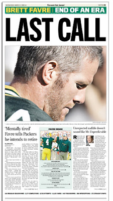
This is the sports page of the Wisconsin State Journal in Madison. It's fairly simple but it's clean and suitable for the occasion. The headline doesn't really impress me, however, and while I like the picture they ran of Favre, I don't consider the page to be anything exceptional. It's solid, but isn't at the level of some other pages I'm posting below.
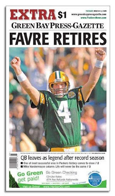
This is a nice attempt by the Green Bay Press-Gazette, but it's ruined by the ad running at the bottom. Unfortunately, putting ads on the front page itself seems to be happening more and more frequently among newspapers. The Mankato Free Press does it now, for example.
I don't even like the idea of putting ads on the front page of inside sections, as the Star Tribune now does. But putting an ad on the actual front page of the paper is inexcusable. I understand why it's being done -- more advertising money -- but the front page of a paper should be sacred, and papers that put ads on their front are basically selling out and helping damage their own credibility (the blame probably lies with the corporations that own said papers).
From a purely artistic and collectable standpoint, this page is degraded by the ad. It's distracting and ugly and ruins whatever aura was created by the rest of the page.

This is from a Sunday commemorative section the Milwaukee Journal Sentinel did. It's the simplest design yet so far and it works the best (although to be fair, this is a special section and therefore isn't bound by the constraints the Wisconsin State Journal had with it's daily sports page). I think this image shows both the front and back page of the section, and the idea used is really a brilliant one. Some might not like the copy of Favre's signature -- I'll admit it's cheesy -- but I like the addition since it gives the page a more significant look.

This page isn't even from a Wisconsin paper -- it's from the Mississippi paper mentioned above, the Biloxi Sun Herald, not far from Favre's hometown. I wonder how much debate went into the decision to use virtually the entire front page of the paper on Favre's retirement; some might have considered it a risky move, but the risk pays off: this is one of the best newspaper fronts I've ever seen.
Once again, it's a relatively simple page with a simple headline and a simple photo. The photo is different from anything else we've seen so far, and it provides a better and more poignant description of what has taken place than some image of Favre on the field. What makes this page even more amazing is another gutsy move: the Sun Herald used reverse type on its mast and continued the image all the way up to the very top of the page. It looks more like a poster than the front page of a newspaper.
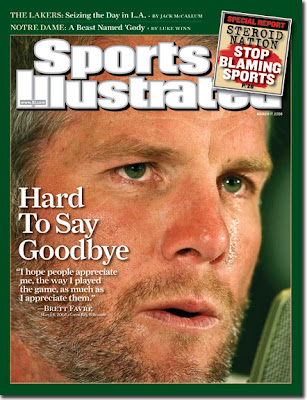
And finally we have the cover of this week's Sports Illustrated. It's not the greatest cover of SI I've seen, but it's not bad either. The photo they used for the cover is a touching one that, like the Sun Herald's image, tells the story effectively and poignantly. The thick green border is slightly overpowering, though, and probably should be thinner than it is. My other complaint is with the stupid "steroids" teaser box at the top right corner. I don't know why SI feels the need to put such gaudy teasers on special fronts such as this. They ultimately take away from the rest of the front -- like the ad on the Green Bay front reviewed above, it's distracting and ugly and takes away from the aura created by the image and headline.
SI did almost this exact thing before on another one of my favorite SI covers:
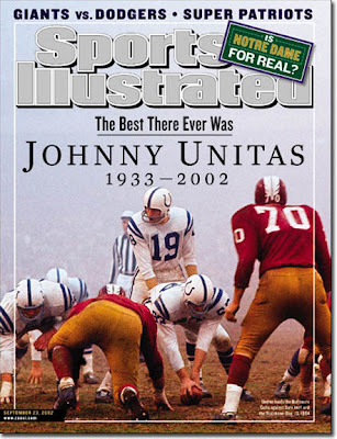
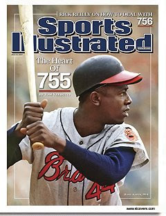
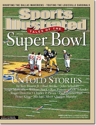
For an example of how much better significant SI covers look without inappropiate teasers, check out these two covers:

1 comment:
I actually read your entire post despite an urge to click away upon seeing the green and yellow and general farve-ness of the whole thing.I don't think I could ever do close to as good of a job as you do with it but I do really enjoy looking at design. I actually thought the SI cover was pretty boring for a magazine that is usually creative. My favorite was the one with Favre's jersey hanging in his locker. That picture pretty much says it all without saying anything.
Post a Comment