I don't mean to rag on local papers too much here, but has anyone noticed the recent size reduction of the Mankato Free Press? Obviously it's not the Free Press' fault -- probably not even the publisher has much say in the issue -- but it's still worth noting. The paper is now about 3/4 of an inch narrower than it was before, and it was already fairly narrow.
Here's what I'm guessing folks at the Free Press do have control over: the amount of white space between the columns of text (there's actually a name for that, which I'm forgetting at the moment). And someone somewhere decided the Free Press would reduce the space between the columns of text. The result is a horrible-looking mess where columns of text run up against and into each other because there isn't enough white space between them. I don't understand why someone, after the first day following the change, didn't open up the paper and immediately say: "This has to be changed back."
I might scan in a copy of a Free Press article to illustrate what I mean. Reading articles in the paper is almost impossible now -- that's how bad it is.
Sunday, April 6, 2008
Friday, March 28, 2008
The comic strip, continued
Posted below is the paper I mentioned in my previous post. It's about the history of the comic strip, and I wrote it as a senior in high school for a writing class. Despite its length, I think it has some pretty interesting information in it since the events surrounding the emergence of the comic strip is something straight out of a soap opera (feuding newspaper tycoons, cartoonists, bidding wars, etc.)
One interesting side note: this was May 2005, when I had been working at the New Ulm Journal for nine months and had dutifully picked up the habit of using lots and lots of paragraphs. The teacher in this particular writing class actually advised me not to use so many, however -- an adjustment I promptly made for his specific assignments. Now I'm in this particular class, where I'm being told the opposite! In the spirit of what we've learned, I've tried to add extra paragraphs in here to break up the text.
The Origin and History of the Comic Strip in American Newspapers
In the introduction to his book Comics of the American West, Maurice Horn wrote that “the comics . . . are not an incoherent series of pictures, but the most authentic form of the dreams, hopes, splendors, fears, and miseries of our century.”
While some people might dismiss this observation as overblown, Horn’s statement is still intriguing, and may help explain the immense popularity that comic strips have enjoyed and continue to enjoy. Despite the immense popularity of this relatively new American art form, however, few people are familiar with either the origin or history of the comic strip in American newspapers.
As a clearly-defined medium, the comic strip can be traced back to the late 19th century. While some disagreement exists regarding who actually “invented” the comic strip, almost every comic strip historian credits Richard F. Outcault’s “the Yellow Kid” as being the first true comic strip to appear in newspapers. Known as Down Hogan’s Alley (later shortened to Hogan’s Alley), the strip debuted in the New York World in early 1895, and was an immediate hit with readers.
Born on Jan. 14, 1863 in Lancaster, Ohio, Richard Outcault demonstrated his artistic talent at an early age. When he was 15, he enrolled in the McMicken University's School of Design in Cincinnati where he studied for three years. After graduating from the school, Outcault worked for Thomas Edison, and even went to Paris as the official artist for Edison’s traveling exhibit of electric lighting.
After moving to New York in 1890, Outcault joined Electrical World magazine (conveniently owned by one of Edison’s friends), and eventually became a regular contributor to both Truth magazine and the New York World.
Outcault’s first breakthrough came in 1894 when the World accepted a six-panel cartoon of his with the caption, “Origin of a New Species, or the Evolution of the Crocodile Explained.” The cartoon consisted of a snake eating a dog, and then suddenly sprouting dog legs from its belly in the next panel.
“The snake then waddled off the scene, crocodile-style,” Stefan Kanfer tells us. “Not particularly hilarious nowadays—but that’s because Outcault’s gag has been plagiarized by newspaper and movie cartoonists for a hundred years.”
It was after this cartoon that the World agreed to run a one-panel strip called Hogan’s Alley. The cartoon, which Francine Silverman described as being “chaotic” in nature, featured black and Irish street children who usually lived in the slums and poor neighborhoods of New York City.
One of these children was a bald-headed, gap-toothed street urchin wearing a nightshirt. Originally only a secondary character, the boy made frequent appearances throughout the months, and soon became the central figure of the strip. The character became especially popular when his nightshirt, which had become a pale blue or tan color with the advent of four-color presses, became a bright yellow shade (hence the name, “the Yellow Kid”).
Within a matter of weeks, Hogan’s Alley literally became the feature of the New York World. When Joseph Pulitzer took over the dying paper in 1883, the circulation of the paper was around 20,000. Within a few months after Pulitzer’s takeover, circulation had increased to 100,000, and by the year 1896 the circulation was nearing 1.5 million.
The Yellow Kid brought relief and humor to a largely poor population that was beset by crime, pollution, and overcrowding. Many of the strip’s readers identified with Outcault’s portrayal of life in the slums. The Kid’s popularity was heightened by the irreverent messages often scrawled on his nightshirt, such as, “Gee, dis beats de carpet, which is hard to beat!” or, “If some pretty girl wot has got a good altogether will pose for me I’ll paint a hood.”
Outcault sold more than just newspapers with his popular creation. The Kid’s likeness appeared on billboards, buttons, cigarette packs, cigars, cracker tins, ladies’ fans, matchbooks, postcards, chewing gum cards, toys, whiskey, and many other products. A Broadway show even starred a character modeled on the comic strip star.
The Yellow Kid’s immense popularity provoked a fierce battle between Pulitzer and fellow newspaper icon William Randolph Hearst, who had bought the rival New York Journal in 1895. In the words of Walker, Hearst stole “Joseph Pulitzer’s thunder as well as his staff.”
One of several staff members who Hearst hired away was Richard Outcault, along with his comic strip creation. The hiring was followed by a bidding war over the cartoonist, which involved Outcault repeatedly switching newspapers, and which a furious Pulitzer eventually lost.
Pulitzer wasn’t about to give up the Yellow Kid just because his star cartoonist switched papers, however. After Outcault started working for Hearst’s Journal, Pulitzer hired a man named George Lukz to take over drawing Hogan’s Alley at the World. As a result, for the next year two different versions of the Yellow Kid competed in the two newspapers, which each paper claiming to have the genuine strip.
The phrase “yellow journalism” (when sensationalism, profiteering, and in some cases propaganda and jingoism take dominance over factual reporting in news media) originates from this battle over the Yellow Kid.
Outcault apparently grew tired of the ensuing legal battle, and as a result cut short the life of his nightshirt-clad character. Writing in the World Encyclopedia of Comics, Horn explained that “as much as [Outcault] relished the money the Kid was bringing, the notoriety of the legal squabble between the World and the Journal over the rights to the Kid was socially embarrasing to him, and as soon as he conveniently and economically could, Outcault left Hearst and introduced a new, more subdued character, Poor L’il Mose, for the New York Herald in 1901.”
According to Silverman, “legend has it that the Yellow Kid’s last appearance was in the New York Journal on Feb. 6, 1898.”
One thing was for sure. Richard Outcault’s pioneering strip demonstrated the immense popularity that cartoons featuring familiar characters and dialogue had with readers. The huge success of Hogan’s Alley almost immediately sparked the appearance of dozens of new comic strips, each building upon and furthering the format and success of Outcault’s creation. Papers such as the San Francisco Examiner and the Philadelphia Inquirer soon began publishing their own Sunday comics sections, and the New York Herald, the paper that is thought to have published the last Yellow Kid comic strip, introduced an astonishing sixty new comic features between the years 1899 and 1905.
Nineteen-year-old Rudolph Dirks was the first person to follow up on the success of the Yellow Kid, launching The Katzenjammer Kids in December of 1897. The strip, which was printed in the American Humorist, a Sunday supplement of Hearst’s Journal, featured the antics of two mischevious German youngsters named Han and Fritz.
Reportedly inspired by a children’s story written by Wilhelm Busch in the 1860s titled Max and Moritz, Dirks freely used stereotypical German-accented English in his strip (“Could ve collect der $100,000 in adwance?” “I vould like my share in dimes und nickels!”) Dirks also was the first person to consistently use “dialogue balloons” inside a strip. As Horn writes, “thanks to Dirks’s efforts, the balloon has become the instantly recognizable trademark of the comic strip.”
Unfortunately, The Katzenjammer Kids fell victim to the same problems that the Yellow Kid faced. After 15 years of writing and drawing the strip, Dirks wanted a break, but Hearst’s newspaper syndicate refused to let him take one. Dirks left in anger, and the syndicate replaced him with Harold Knerr. Dirks later sued, and after another legal battle, the Hearst papers were allowed to continue the Katzenjammer strip, while Dirks was allowed to syndicate a “nearly identical” strip.
According to Reitburger and Fuchs, “in a court case [Dirks] lost the right to retain the title, but was granted the copyright of his characters.” Originally called Hans and Fritz, the name of Dirks’s “new” strip was later switched to The Captain and the Kids, when the outbreak of World War 1 rendered the German origin of the names a source of embarrasment. Written and drawn by various artists over the years, The Katzenjammer Kids continues to this day as the oldest strip in circulation.
Richard Outcault made another splash when he created Buster Brown in 1902, duplicating the success he had with the Yellow Kid. The strip, which starred a young boy (Buster Brown), his sister Mary Jane, and his dog Tige, was the first comic to feature a talking animal. Outcault originally created Buster Brown while at the Herald, but in 1906 he returned to Hearst, taking the strip with him. After yet another court battle over the ownership of a comic strip, Outcault continued his now nameless feature in Hearst papers, while the Herald continued its own version of Buster Brown with other artists. The Herald’s version continued until 1911, while Outcault drew his version until 1921.
In 1903 Clare Briggs and Moses Koenigsberg created a comic strip titled A. Piker Clerk, which revolved around the escapades of a racetrack gambler who placed bets. The strip ran in both of William Hearst’s Chicago papers, but was canceled after only a few months by Hearst, who considered the strip to be “vulgar.”
But Bud Fisher took note of the strip, and four years later he used virtually the same storyline to create a strip called Mutt and Jeff. The strip ran daily in the sports pages of the San Francisco Chronicle (Fisher was the paper’s sports cartoonist), and became an overnight sensation that sharply increased the daily circulation of the Chronicle.
Up until the time of Mutt and Jeff, virtually all comic strips were a once-a-week feature that appeared in the Sunday edition of newspapers. After Mutt and Jeff pioneered the idea of a seven-day-a-week comic strip, other cartoonists quickly followed, and on Jan. 31, 1912, Hearst introduced America’s first full daily comic page in the New York Evening Journal.
After only a few days, he added the comics section to all the other newspapers he owned across the country. Initially only made up of four large daily comics, Hearst gradually expanded the section to nine strips by the early 1920s. Other papers quickly followed.
Syndicates (associations of people or firms authorized to undertake a duty or transact specific business) soon began forming. One of the first syndicates that popped up was the Newspaper Feature Syndicate, which was incorporated in 1913. According to founder Moses Koenigsberg, it was the “first independent syndicate organized to supply a complete budget of features to seven-day-a-week publications.”
Other independent distributors included the George Matthew Adams Syndicate and the McNaught Syndicate, which both formed around 1910. In 1915, Koenigsberg launched King Features Syndicate, which remains one of, if not the leading distributor of comics today. By 1935, 130 syndicates were offering more than 1,600 features to almost 14,000 daily and Sunday newspapers across the world.
It was from the late 1920s to the ‘40s that comic strips truly flourished in American newspapers. In the book Krazy Kat: The Comic Art of George Herriman, cartoonist Patrick McDonnell wrote:
“Unlike today’s cartoonists, who often work at home, the pioneers in this field reported to the newspaper’s art room every day, and put in eight (or more) hours side by side at their drawing tables. They were newspapermen in the true sense of the word. A spirit of camaraderie, affection, and understanding linked these early artists, and they would often make joking references to one another in print. They were celebrities of the day and lived their lives to the fullest in the high style they could well afford.”
Legal battles between newspapers over comic strip rights notwithstanding, cartoonists had an immense amount of freedom, often quitting one strip and starting up another on a whim. Cities almost always had several newspapers (Chicago circa. 1920 had six major daily newspapers), and the intense local competition allowed cartoonists ample opportunity to experiment with different strips, trying ideas out for size.
George Herriman is perhaps the best example of this: between 1902 and 1911 Herriman created around 15 different strips that ran for varying lengths of time and met with varying degrees of success. (Some of these strips included Two Jollie Jackies, Baron Mooch, Gooseberry Sprig, and The Family Upstairs.)
In 1911 he finally created the strip Krazy Kat, which ran for more than 30 years until his death, and for which he is most famous today. However, even after Krazy Kat was a staple of the comics section, Herriman continued to experiment and create other strips.
While humorous comic strips continued to remain popular through the 1930s and ‘40s, adventure strips began to make their own mark. Horn writes that “adventure strips flourished in this period as in no time before or since.” Chief among these was Dick Tracy, a comic strip featuring a square-jawed, crime fighting detective that burst into newspapers in 1931. Creator Chester Gould admitted that his strip was directly inspired by the wave of organized crime that was sweeping Chicago in the 1920s.
As Gould explained, “the revelation of fixed juries, crooked judges, bribery of public officials and cops who looked the other way showed the crying need for a strong representative of law and order who would take an eye for an eye and a tooth for a tooth.”
Dick Tracy did not run in as many papers as other popular comic strips did, but according to Herb Galewitz, no strip approached Dick Tracy in intensity of readership during the 1930s and ‘40s. The strip inspired huge amounts of merchandise as fans eagerly soaked up everything from toys and games to movies and radio shows.
While Dick Tracy was busy fighting vile gangsters and evil criminal masterminds, other new genres began to develop in the 1930s. Strips such as Flash Gordon, Buck Rogers and Jack Swift introduced the realm of science fiction to the newspaper comics, while “soap opera” strips became increasingly popular with the help of comics such as Little Orphan Annie, Brenda Starr, and Rex Morgan M.D. Dozens of cartoonists began setting their strips in the Wild West, featuring ruthless outlaws, ramshackle towns and wild shootouts. The artwork of this era was simply outstanding, as artists such as Hal Foster (Prince Valiant), Alex Raymond (Rip Kerby) and Milton Caniff (Terry and the Pirates, Steve Canyon) produced spectacular illustrations to accompany the gripping storylines.
The direction of the comic strip since the 1950s can be illustrated by Ernest Brennecke’s statement that “the funny paper has . . . become not only a faithful reflection of the tastes and ethical principles of the country at large; it is also manifestly an extremely powerful organ of social satire."
Walt Kelly was one of the first cartoonists to openly use his strip as a platform for commentary on the passing political and social scene. The creator of Pogo, Kelly lampooned various political figures, over the years introducing unflattering caricatures of Joe McCarthy, Lyndon B. Johnson, Nikita Khrushchev, and J. Edgar Hoover, among others.
Kelly’s most famous satire was his 1953 portrayal of McCarthy, when he did a long story involving an authoritative wildcat named “Simple J. Malarkey” with facial features that bore a striking resemblance to the senator’s. In more recent years, Garry Trudeau’s Doonesbury and Aaron McGruder’s The Boondocks have become notorious for the political statements their respective creators make in their strips, while Johnny Hart, the creator of B.C., has received both praise and criticism for his strip’s religious themes on certain holidays.
Even if not always controversial, most strips today contain at least some social commentary or satire, whether it be criticism of modern artwork and crass commercialism in Bill Watterson’s Calvin and Hobbes, or parodies of Star Wars and Lord of the Rings in Bill Amend’s FoxTrot (“Orlando Bloom has ruined everything!” Lord of the Rings geek Jason complains after finding out his sister has ordered tickets to The Two Towers before he has. Amend chose to use the line as the title for his latest compilation of FoxTrot strips.)
While comics like Watterson’s Calvin and Hobbes and Jerry Scott and Jim Borgman’s Zits continue to propel the comics today, many cartoonists are struggling to deal with the problem of shrinking space and less artistic freedom. In an interview done in 2002, Amend spoke about this problem in the comics, saying that “the shrinking space issue was around before I started FoxTrot, so I sort of accepted that trend when I signed on.”
What bothers Amend more is a newer trend where newspapers distort the actual proportions of a comic strip in order to fit it into a space it normally would not fit.
“I’ve seen my strip printed almost as a square,” Amend stated. “It’s infuriating, but the syndicates are so timid . . . with client papers, that there aren’t easy ways to end the practice. And a lot of papers’ editors don’t even know their pagination people are doing this.”
Watterson has been even more vocal in his criticism of this problem. In a speech delivered at the Festival of Cartoon Art at Ohio State University in 1989, Watterson complained that with the current size the comics are printed at, “there is no room for real dialogue, no room to show action, no room to show exotic worlds or foreign lands, no room to tell a decent story. Consequently, today’s comics pages are filled with cartoon characters who sit in blank backgrounds spouting silly puns.”
The difference in the size of the comics is truly startling. In the 1920s and ‘30s a single Sunday comic strip often filled an entire newspaper page. The entire Sunday comics section itself ballooned, with newspapers often carrying up to 16 pages of comics. William Hearst himself initiated an unheard of 32-page Sunday comics section in 1935. It wasn’t until the 1940s that Sunday strips were sometimes reduced to only half pages or occasionally even one-third pages.
Sunday strips are not the only ones that have felt the squeeze, however: daily strips have also shrunk over the years. Watterson claims that when it comes to dailies, cartoonists today work with nearly one-third less space then they did in the 1970s, adding that “strips had already lost a lot of space” by that time.
Not all cartoonists are objecting as vehemently as Watterson and others have. In his book Peanuts: A Golden Celebration, Charles Schulz wrote that “while some other cartoonists complain that it is becoming impossible to think out the plot of a strip in this decreasing space, there’s the real challenge of fitting the story into the tiny rectangle. For my part, it has made me more inventive in trying to make each day’s story complete.”
There is hope that this 60-year trend will be reversed. In the past decade or so, several creators of popular comic strips have exerted control over their creations by switching layouts and forcing newspapers to either run the new layout or drop the strip.
Moreover, the popularity of the internet has led to the existence of numerous e-comics which are published in cyberspace. The creators of these diverse strips are not as hindered by space, art, or subject matter constraints as more traditional comic are. As a result, many cartoonists believe that the future of cartooning actually lies in the online world.
Times have dramatically changed since 1900, but the comic strip has remained a constant ray of sunshine in newspapers across America and across the world. Through war and peace, economic disasters and booms, turmoil and prosperity, the comic strip has always been there for Americans of all ages to read on a daily basis.
It has obviously changed over those 100+ years: John Canaday, in his forward to The Smithsonian Collection of Newspaper Comics, wistfully wrote that “you have to be lucky enough to have been around for a rather long stretch of years . . . to remember a time when newspaper comics were just newspaper comics rather than sociological documents and works of art with their own set of innovative esthetic principles, which they have become.”
But in its essence, the comic strip is still the same at heart, and still provides the same type of enjoyment to readers today that Richard Outcault first brought to his readers in 1895.
The decline of the comic strip
I've been a fan of comic strips for a long time now. I collect old comic strip book collections and at one time entertained the thought of trying to make a career out of cartooning. (I've given that dream up, at least for now, for two reasons: I don't have the time to do it, and more importantly, I don't have the sense of humor to do it.) In my bookshelves you'll find everything from "B.C.," "Crock" and "The Wizard of Id" to "Peanuts," "Calvin and Hobbes," "FoxTrot" and classic "Dick Tracy."
Unfortunately, the comic strip is another area where the newspaper industry has screwed itself over royally. The comics page is one of most beloved, popular parts of the newspaper. Some comic strips -- "Peanuts," for example -- become enduring examples of American culture, and characters like Charlie Brown and Snoopy and Calvin and Hobbes become cultural icons. In fact, comic strips played an important role in the very development of American newspapers, and are in essence a distinctly American form of art. I actually wrote a paper about this in high school, which I may or may not post on here later (depends on if I can find it).
 A "Little Orphan Annie" Sunday full-page comic strip from 1924
The purpose of this post, however, is to point out that comic strips used to be given much more space than they are today. Daily strips today are given only half the space they had as late as the 1950s (i.e., they're run only half the size). Back in the 1920s and '30s, Sunday comic strip sections would frequently have only one comic strip per page. Today four or five strips are squeezed together on a single page in the Sunday comics section. The strips are run smaller and the cartoonists are given fewer panels with which they tell a story or a joke.
It's no coincidence that the comics are only a shell of what they used to be. It's virtually impossible to tell a joke or an interesting story in such limited space, much less illustrate anything interesting. The Star Tribune, for example, today runs its strips so small that one can barely read the text in the dialogue balloons. Cartoonists, who were once subject to bidding wars between newspapers desperate for their services, are now merely an afterthought, with their work displayed in stamp-size boxes next to the horoscopes and crossword puzzle. It's truly a travesty.
Why newspapers decided to neuter one of their staple products is a mystery to me. Today, of course, it's a moot point, since the Internet has provided a new outlet for both established and aspiring cartoonists -- an outlet where space and newsprint isn't an issue. But it's still an interesting point to ponder.
Unfortunately, the comic strip is another area where the newspaper industry has screwed itself over royally. The comics page is one of most beloved, popular parts of the newspaper. Some comic strips -- "Peanuts," for example -- become enduring examples of American culture, and characters like Charlie Brown and Snoopy and Calvin and Hobbes become cultural icons. In fact, comic strips played an important role in the very development of American newspapers, and are in essence a distinctly American form of art. I actually wrote a paper about this in high school, which I may or may not post on here later (depends on if I can find it).
The purpose of this post, however, is to point out that comic strips used to be given much more space than they are today. Daily strips today are given only half the space they had as late as the 1950s (i.e., they're run only half the size). Back in the 1920s and '30s, Sunday comic strip sections would frequently have only one comic strip per page. Today four or five strips are squeezed together on a single page in the Sunday comics section. The strips are run smaller and the cartoonists are given fewer panels with which they tell a story or a joke.
It's no coincidence that the comics are only a shell of what they used to be. It's virtually impossible to tell a joke or an interesting story in such limited space, much less illustrate anything interesting. The Star Tribune, for example, today runs its strips so small that one can barely read the text in the dialogue balloons. Cartoonists, who were once subject to bidding wars between newspapers desperate for their services, are now merely an afterthought, with their work displayed in stamp-size boxes next to the horoscopes and crossword puzzle. It's truly a travesty.
Why newspapers decided to neuter one of their staple products is a mystery to me. Today, of course, it's a moot point, since the Internet has provided a new outlet for both established and aspiring cartoonists -- an outlet where space and newsprint isn't an issue. But it's still an interesting point to ponder.
Thursday, March 13, 2008
If you're not a Packers fan, look away ...
I'm going to take time out to do another post on publication designs, this time related to Green Bay quarterback Brett Favre's recent retirement. It was kind of a big deal for football fans -- Packers fans especially -- and a number of newspapers went all out with their coverage. One Mississippi paper dedicated virtually its entire front page to his retirement, while the Green Bay paper published a special 12-page section the day after his retirement. The Milwaukee paper also did a special section.
As a Packers fan, I wasn't pleased to hear of Favre's retirement. Still, it's nice to see some of the great work that newspapers and magazines have done in their coverage of Favre, especially when it comes to layout. Like I mentioned to someone at the Reporter, it must be an incredible experience for graphic designers and layout people who work at, say, the Milwaukee or Green Bay papers when an event like this occurs. How can it not bring out the best in everyone, knowing there will be runs on newspapers, some of which will reach collector item status?
I'm going to post some of newspaper pages I've been able to find so far. In addition, I'm going to post my thoughts on the pages. I haven't really done that in my previous posts on design, but I think readers might find it more interesting. I'm interested in hearing your thoughts on the papers' designs as well!
Without further ado ...
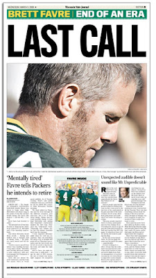
This is the sports page of the Wisconsin State Journal in Madison. It's fairly simple but it's clean and suitable for the occasion. The headline doesn't really impress me, however, and while I like the picture they ran of Favre, I don't consider the page to be anything exceptional. It's solid, but isn't at the level of some other pages I'm posting below.
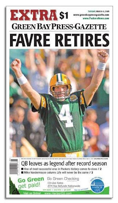
This is a nice attempt by the Green Bay Press-Gazette, but it's ruined by the ad running at the bottom. Unfortunately, putting ads on the front page itself seems to be happening more and more frequently among newspapers. The Mankato Free Press does it now, for example.
I don't even like the idea of putting ads on the front page of inside sections, as the Star Tribune now does. But putting an ad on the actual front page of the paper is inexcusable. I understand why it's being done -- more advertising money -- but the front page of a paper should be sacred, and papers that put ads on their front are basically selling out and helping damage their own credibility (the blame probably lies with the corporations that own said papers).
From a purely artistic and collectable standpoint, this page is degraded by the ad. It's distracting and ugly and ruins whatever aura was created by the rest of the page.

This is from a Sunday commemorative section the Milwaukee Journal Sentinel did. It's the simplest design yet so far and it works the best (although to be fair, this is a special section and therefore isn't bound by the constraints the Wisconsin State Journal had with it's daily sports page). I think this image shows both the front and back page of the section, and the idea used is really a brilliant one. Some might not like the copy of Favre's signature -- I'll admit it's cheesy -- but I like the addition since it gives the page a more significant look.

This page isn't even from a Wisconsin paper -- it's from the Mississippi paper mentioned above, the Biloxi Sun Herald, not far from Favre's hometown. I wonder how much debate went into the decision to use virtually the entire front page of the paper on Favre's retirement; some might have considered it a risky move, but the risk pays off: this is one of the best newspaper fronts I've ever seen.
Once again, it's a relatively simple page with a simple headline and a simple photo. The photo is different from anything else we've seen so far, and it provides a better and more poignant description of what has taken place than some image of Favre on the field. What makes this page even more amazing is another gutsy move: the Sun Herald used reverse type on its mast and continued the image all the way up to the very top of the page. It looks more like a poster than the front page of a newspaper.
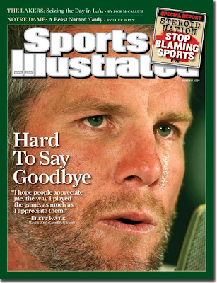
And finally we have the cover of this week's Sports Illustrated. It's not the greatest cover of SI I've seen, but it's not bad either. The photo they used for the cover is a touching one that, like the Sun Herald's image, tells the story effectively and poignantly. The thick green border is slightly overpowering, though, and probably should be thinner than it is. My other complaint is with the stupid "steroids" teaser box at the top right corner. I don't know why SI feels the need to put such gaudy teasers on special fronts such as this. They ultimately take away from the rest of the front -- like the ad on the Green Bay front reviewed above, it's distracting and ugly and takes away from the aura created by the image and headline.
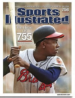
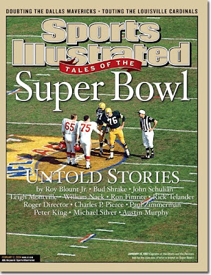
SI did almost this exact thing before on another one of my favorite SI covers:
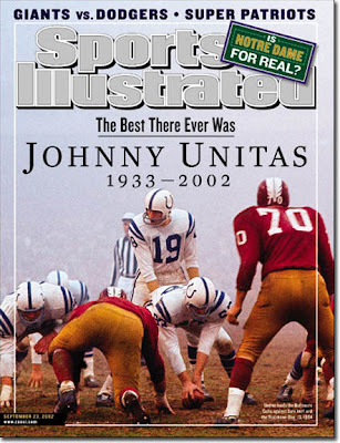
For an example of how much better significant SI covers look without inappropiate teasers, check out these two covers:
As a Packers fan, I wasn't pleased to hear of Favre's retirement. Still, it's nice to see some of the great work that newspapers and magazines have done in their coverage of Favre, especially when it comes to layout. Like I mentioned to someone at the Reporter, it must be an incredible experience for graphic designers and layout people who work at, say, the Milwaukee or Green Bay papers when an event like this occurs. How can it not bring out the best in everyone, knowing there will be runs on newspapers, some of which will reach collector item status?
I'm going to post some of newspaper pages I've been able to find so far. In addition, I'm going to post my thoughts on the pages. I haven't really done that in my previous posts on design, but I think readers might find it more interesting. I'm interested in hearing your thoughts on the papers' designs as well!
Without further ado ...

This is the sports page of the Wisconsin State Journal in Madison. It's fairly simple but it's clean and suitable for the occasion. The headline doesn't really impress me, however, and while I like the picture they ran of Favre, I don't consider the page to be anything exceptional. It's solid, but isn't at the level of some other pages I'm posting below.

This is a nice attempt by the Green Bay Press-Gazette, but it's ruined by the ad running at the bottom. Unfortunately, putting ads on the front page itself seems to be happening more and more frequently among newspapers. The Mankato Free Press does it now, for example.
I don't even like the idea of putting ads on the front page of inside sections, as the Star Tribune now does. But putting an ad on the actual front page of the paper is inexcusable. I understand why it's being done -- more advertising money -- but the front page of a paper should be sacred, and papers that put ads on their front are basically selling out and helping damage their own credibility (the blame probably lies with the corporations that own said papers).
From a purely artistic and collectable standpoint, this page is degraded by the ad. It's distracting and ugly and ruins whatever aura was created by the rest of the page.

This is from a Sunday commemorative section the Milwaukee Journal Sentinel did. It's the simplest design yet so far and it works the best (although to be fair, this is a special section and therefore isn't bound by the constraints the Wisconsin State Journal had with it's daily sports page). I think this image shows both the front and back page of the section, and the idea used is really a brilliant one. Some might not like the copy of Favre's signature -- I'll admit it's cheesy -- but I like the addition since it gives the page a more significant look.

This page isn't even from a Wisconsin paper -- it's from the Mississippi paper mentioned above, the Biloxi Sun Herald, not far from Favre's hometown. I wonder how much debate went into the decision to use virtually the entire front page of the paper on Favre's retirement; some might have considered it a risky move, but the risk pays off: this is one of the best newspaper fronts I've ever seen.
Once again, it's a relatively simple page with a simple headline and a simple photo. The photo is different from anything else we've seen so far, and it provides a better and more poignant description of what has taken place than some image of Favre on the field. What makes this page even more amazing is another gutsy move: the Sun Herald used reverse type on its mast and continued the image all the way up to the very top of the page. It looks more like a poster than the front page of a newspaper.

And finally we have the cover of this week's Sports Illustrated. It's not the greatest cover of SI I've seen, but it's not bad either. The photo they used for the cover is a touching one that, like the Sun Herald's image, tells the story effectively and poignantly. The thick green border is slightly overpowering, though, and probably should be thinner than it is. My other complaint is with the stupid "steroids" teaser box at the top right corner. I don't know why SI feels the need to put such gaudy teasers on special fronts such as this. They ultimately take away from the rest of the front -- like the ad on the Green Bay front reviewed above, it's distracting and ugly and takes away from the aura created by the image and headline.
SI did almost this exact thing before on another one of my favorite SI covers:

For an example of how much better significant SI covers look without inappropiate teasers, check out these two covers:


Tuesday, March 11, 2008
And now from the NYT ...
Yesterday's New York Times had an article about citizen journalism, except, as the Times' lede notes, not everyone likes the term "citizen journalism":
It's an interesting article that's worth checking out. I would have liked to see more time spent on the concept of "citizen journalism" itself, but it's meant to be a feature story on a media experiment based in Philadelphia, so that's where the focus lies.
“We are uncomfortable with the term ‘citizen journalism,’ ” said Todd Wolfson, 35, a doctoral candidate at the University of Pennsylvania and one of the organizers of the Media Mobilizing Project in Philadelphia. “We prefer the term ‘community journalism.’ ”
Citizen journalism has become the faddish name for the effort to encourage regular folk to use the Internet to report the news directly, but Mr. Wolfson had a point: many of the people whom his organization and an immigrant rights group, Juntos, are teaching to make video reports for streaming on the Internet are not citizens. Many are not even legal residents.
The hope, however, is that they can be journalists.
It's an interesting article that's worth checking out. I would have liked to see more time spent on the concept of "citizen journalism" itself, but it's meant to be a feature story on a media experiment based in Philadelphia, so that's where the focus lies.
Monday, March 10, 2008
Another poll, another surprise
I happened upon this Reuters story today, which summarizes the results of a Harris Interactive Survey on political blogs. The poll shows that a majority of Americans do not read political blogs, and only 22 percent of Americans read political blogs regularly.
Those numbers don't really surprise me -- in fact, they're what I would have expected. Another statistic buried deeper in the article did surprise me, however.
According to the poll, those most likely to read political blogs are age 63 and older, with 26 percent of that age bracket reading them. Meanwhile, 23 percent of those ages 44-62 read political blogs. But only 19 percent of those 18 to 31 and 17 percent of those 32 to 43 read political blogs.
That statistic floors me. I'm well aware that many younger people have little to no interest in current events, and I'm aware that older folks -- especially those who are retired -- probably have a bit more free time with which they can browse blogs.
I'm still having a hard time wrapping my head around that statistic, though. Are we really underestimating older generations' use of blogs and overestimating younger generations' use of blogs?
Tuesday, March 4, 2008
Citizen journalism: the Chinese version
I happened upon this story recently, and something really caught my eye as I skimmed it.
China's state-run news agency was forced to give an apology about two weeks ago for publishing a doctored photo of rare antelope near a train. The significance of the doctored photo -- it has something to do with environmental propoganda -- is important, but not quite as interesting as finding out who discovered the photo was fake: basically a blogger.
What makes this example of citizen journalism in action even more impressive is that censorship of the internet appears to be common in China. Would-be bloggers and other internet users there don't have the unlimited freedom of exploration Americans -- thus far -- still have with the world wide web. That didn't prevent this incident, however, which is another excellent example of citizen journalism serving as a watchdog of traditional media.
China's state-run news agency was forced to give an apology about two weeks ago for publishing a doctored photo of rare antelope near a train. The significance of the doctored photo -- it has something to do with environmental propoganda -- is important, but not quite as interesting as finding out who discovered the photo was fake: basically a blogger.
Suspicions about the photo became public last week after Mr. Liu's photograph was displayed in Beijing's subway system. An anonymous Chinese Internet user going by the screen name Dajiala raised questions about the photo's authenticity on one of China's largest photography Web sites. Dajiala, a photographer who claimed to idolize Mr. Liu, said he was studying a copy of the photo posted on Beijing's Line 5 subway platform when he rubbed some dust off it and noticed something odd.
"At the bottom of the photograph, there was a very obvious line," he wrote. "I examined it very carefully and it was obviously the stitching of two different images....Was this decisive moment just a simple Photoshop trick?"
His post created an online storm. Photographers blew up the image and analyzed each out-of-place pixel. Animal behaviorists weighed in, explaining that antelope are shy and noise-sensitive, and would scatter in panic at the sound of the high-speed train. When the chat-room controversy spread to China's largest Internet portals, the Chengdu Business Daily confronted Mr. Liu.
What makes this example of citizen journalism in action even more impressive is that censorship of the internet appears to be common in China. Would-be bloggers and other internet users there don't have the unlimited freedom of exploration Americans -- thus far -- still have with the world wide web. That didn't prevent this incident, however, which is another excellent example of citizen journalism serving as a watchdog of traditional media.
Subscribe to:
Comments (Atom)
